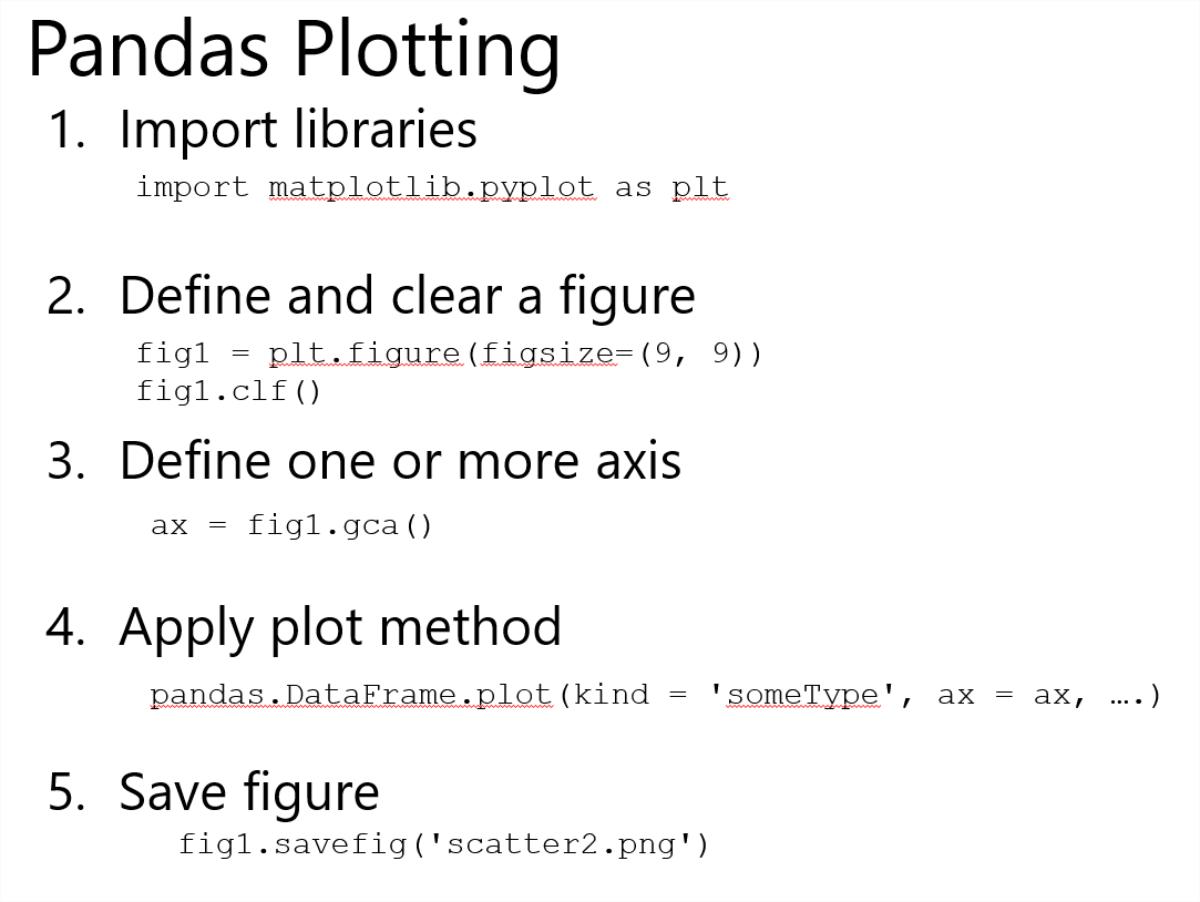
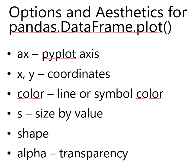
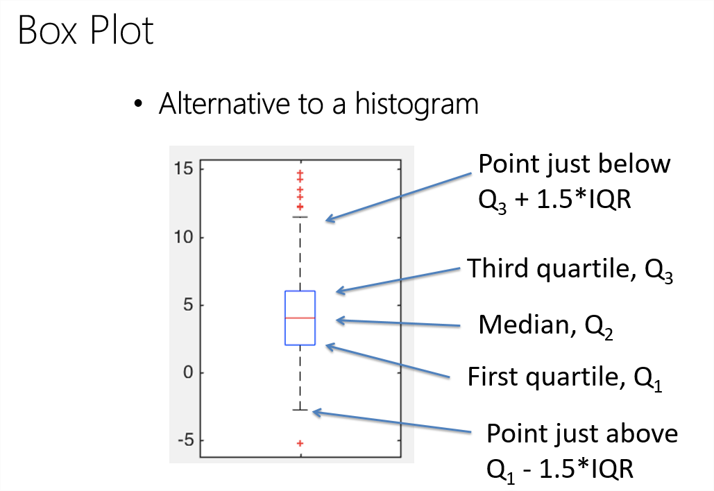
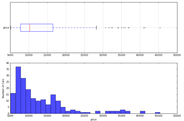
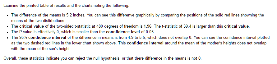
defplotstats(df, col): import matplotlib.pyplot as plt ## Setup for ploting two charts one over the other fig, ax = plt.subplots(2, 1, figsize = (12, 8)) ## First a box plot df.dropna().boxplot(col, ax = ax[0], vert = False, return_type = 'dict') ## Plot the histogram temp = df[col].as_matrix() ax[1].hist(temp, bins = 30, alpha = 0.7) plt.ylabel('Number of Cars') plt.xlabel(col) return [col]
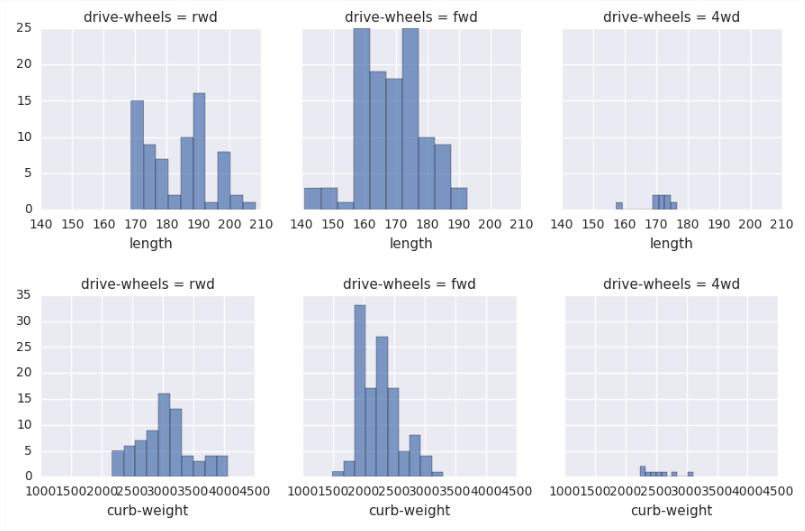
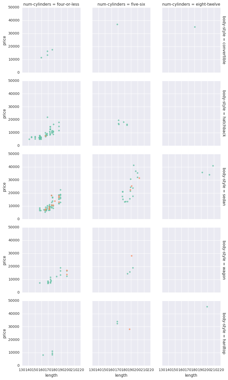
## Function to plot conditioned histograms defcond_hists(df, plot_cols, grid_col): import matplotlib.pyplot as plt import seaborn as sns ## Loop over the list of columns for col in plot_cols: grid1 = sns.FacetGrid(df, col = grid_col) grid1.map(plt.hist, col, alpha = .7) return grid_col
## Define columns for making a conditioned histogram plot_cols = ['length', 'curb-weight', 'engine-size', 'city-mpg', 'price'] cond_hists(auto_price, plot_cols, 'drive-wheels')
Conditioned Box Plot
1 2 3 4 5 6 7 8 9 10 11 12
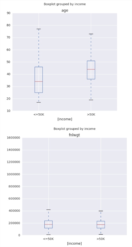
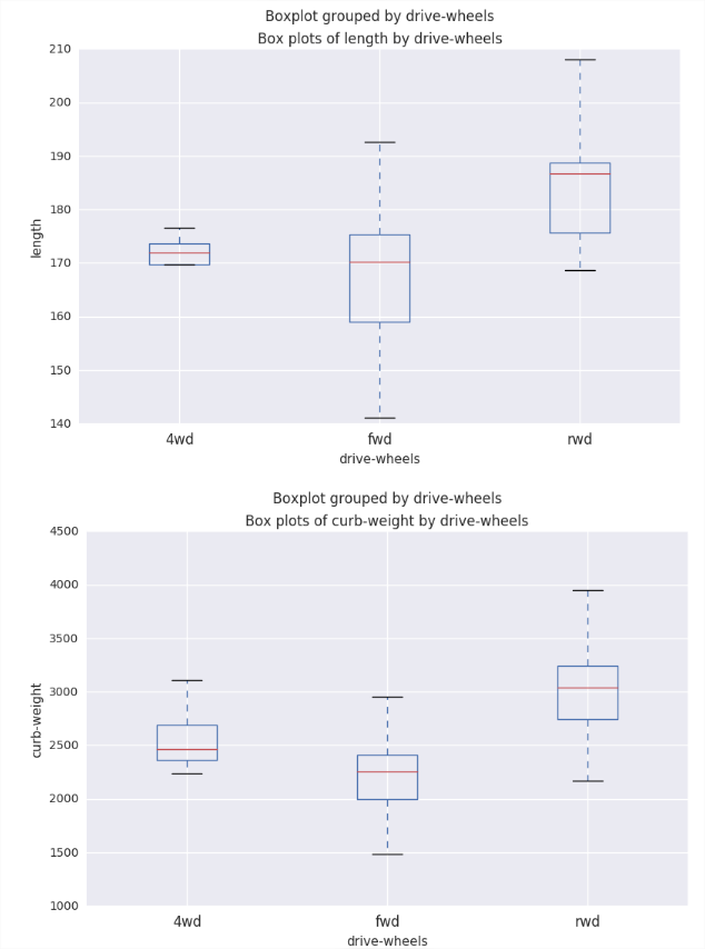
## Create boxplots of data defauto_boxplot(df, plot_cols, by): import matplotlib.pyplot as plt for col in plot_cols: fig = plt.figure(figsize = (9, 6)) ax = fig.gca() df.boxplot(column = col, by = by, ax = ax) ax.set_title('Box plots of ' + col + ' by ' + by) ax.set_ylabel(col) return by